View FTE Differential statistic
For the selected zoom level, view the Full Time Equivalent (FTE) Differential statistic and the color-coded tolerance threshold for each time interval. These thresholds indicate whether the Forecasted FTE is above, within, below, or far below the requirements tolerance. In addition, view the total FTE Required and FTE Forecasted values for the selected day, week, or period.
The visual display of this statistic provides a quick, easy-to-understand overview of how well the schedule covers forecast requirements, highlighting periods with significant under-staffing or over-staffing. This visualization allows you to easily and adjust staffing levels, as required.
Before you begin
Configure required tolerance color
Procedure
-
Go to Forecasting and Scheduling. Under Calendar, select Calendar.
-
Select a campaign Collection of scheduling periods in WFM, which are defined time periods where specific employees target specific workloads., scheduling period, and queue Entity that represents demand in WFM. Queues help predict workload by multiplying the volume of customer interactions by their expected handling time. for which you want to view statistics.
-
Determine the zoom level for which you want to view statistics (Hours, Day, Week, or Period).
-
Under Statistics, select FTE Differential.
-
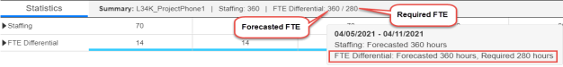
From the Statistics tab on the bottom of the screen, view the Summary bar. It lists the selected queue, and the totals for all selected statistics. When you point to the Summary bar, the tooltip displays the date range, and the statistics for that date range.
For FTE Differential, it displays the Forecasted FTE / Required FTE for the selected zoom level. If you select Hours or Day zoom, it shows the daily total. If you select Week zoom, it shows the weekly total. If you select Period zoom, it shows the total for the entire scheduling period. (If the scheduling period is only one week long, the Period and Week totals are the same.)
For example, the Calendar is set to Week zoom level. For FTE Differential, the Forecasted FTE is 360 hours, and the Required FTE is 280 for the week, 4/5/2021-4/11/2021.
-
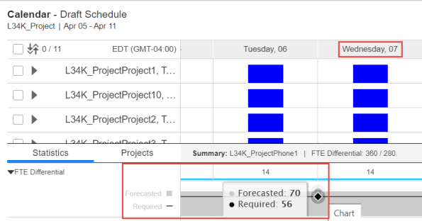
To display FTE Differential data for each individual time interval, select the arrow next to FTE Differential to expand it.
-
View the Forecasted FTE vs. Required FTE data for a specific time interval by placing your cursor at the beginning of the time interval you want.
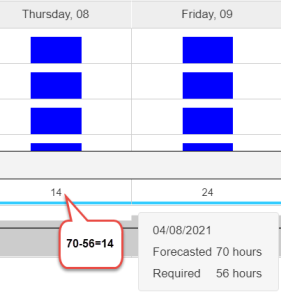
For example, to view this data for Wednesday, April 7, place the cursor on the left line of that day. The tooltip shows that the Forecasted FTE hours are 70 and the Required FTE hours are 56.
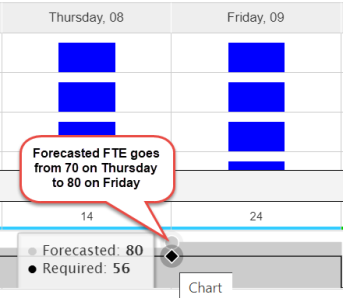
On the chart, the Forecasted FTE value is displayed as a light gray shading, and the Required FTE value is displayed as a bold black line. As the values change between intervals, the gray shading and the bold black line change their representation accordingly.
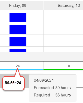
For example, the Forecasted FTE is 70 on Thursday and 80 on Friday. The chart displays this visually with the gray shading rising higher on Friday than on Thursday, and the bold black line representing the Required FTE staying the same (as it did not change from 56 from Thursday to Friday).
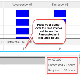
You can also see the Forecasted and Required FTE values by placing your cursor over the specific time interval you want. For example, place your cursor over the time interval for Wednesday, April 7. The tooltip shows the date, and the number of Forecasted and Required FTE hours for that date.
-
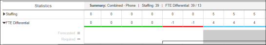
To view the FTE Differential values, view the numbers in each cell. The values are the difference between the FTE Forecasted and FTE Required values (Forecasted FTE - Required FTE). This value can be positive or negative.
-
View whether the Forecasted FTE is defined as being above, within, below, or far below the requirements tolerance:
-
For the relevant cell, view the colored line below the FTE Differential value.
-
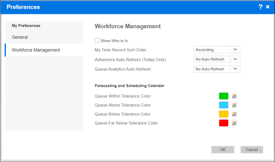
To understand the meaning of this color, from the logged in user name, select Preferences. From My Preferences, select Workforce Management.
For example, based on the Workforce Management Preferences:
-
The green lines indicate that the queue is within the tolerance level for FTE hours for that time period.
-
The blue lines indicate that the queue is above the tolerance level for FTE hours for that time period.
-
The yellow lines indicate that the queue is below the tolerance level for FTE hours for that time period.
-
The red lines indicate that the queue is far below (2 x below) the tolerance level for FTE hours for that time period.
-
-
-
To understand the meaning of a tolerance threshold:
-
Go to Organization Management Module in WFO that allows administrators to set up different hierarchies to manage users from a single, unified, Web interface.. Under Hierarchies, select Organization Settings.
-
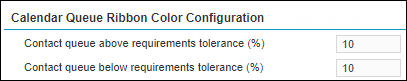
From the Calendar Queue Ribbon Color Configuration section, view the values for the parameters: Contact queue above requirements tolerance (%) and Contact queue below requirements tolerance (%).
-
For the relevant cell, view the colored line below the FTE Differential value, and the Required FTE and Forecasted FTE values, to analyze why that color appears for this time interval.
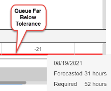
For example, if the line is red, it means that the queue is far below (2 x below) the tolerance level for FTE hours for the time interval. How did we get here? The Contact queue below requirements tolerance (%) parameter is set to 10%. The Required FTE value for this time interval is 52 hours. Because 10% of 52 = 5.2, and the far below tolerance level is less than twice the value of the below tolerance value, the tolerance threshold in this example is: 2 x 5.2 = 10.4. Therefore, 52 - 10.4 = 41.6, so 41.6 is the lowest value for the below tolerance value, and 0–41.5 is considered far below tolerance.
As the Forecasted FTE is 31, this value is considered to be far below tolerance. Therefore, the line below this FTE Differential value is red, representing the far below tolerance threshold.
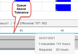
In another example, the line is blue, which means that the queue is above the tolerance level for FTE hours for the time interval. The Contact queue above requirements tolerance (%) parameter is set to 10 (%). The Required FTE value for this time interval is 93 hours. Because 10% of 93 = 9.3, the Forecasted FTE for that time interval can be up to 9.3 above the Required FTE (or 93–102.3) to be considered within tolerance.
As the Forecasted FTE is 141, this value is considered to be above tolerance. Therefore, the line below this FTE Differential value is blue, representing the above tolerance threshold.
-